Customizing Visualization in Zendesk Ticket Reports
Can I customize the visualization of my Zendesk ticket report?
Yes, you can customize the visualization of your Zendesk ticket report. After setting up your report with the necessary metrics and attributes, you can change the visualization type to best convey your insights.
By default, Zendesk Explore uses a column chart, but you can select other graph types from the Visualization type menu. This flexibility allows you to present your data in a way that is most meaningful and easy to understand for your audience.
More related questions
How can I report on tickets created by group per month in Zendesk?
To report on tickets created by group per month in Zendesk, you can use the Explore recipe provided. This involves creating a report in Zendesk Explore that tracks the monthly count of tickets assigned within a specific group. You'll need Zendesk…
What skill level is required to create a report on tickets by group per month?
Creating a report on tickets by group per month in Zendesk requires a moderate skill level. This means you should be comfortable navigating Zendesk Explore and have some experience with creating reports. The process involves selecting the…
What permissions are needed to create a Zendesk report on tickets by group?
To create a Zendesk report on tickets by group, you need Editor or Admin permissions in Zendesk Explore. These permissions allow you to access the necessary datasets and tools to build and customize reports. If you don't have these permissions, you…
How do I select specific groups in my Zendesk ticket report?
To select specific groups in your Zendesk ticket report, use the report visualization interface. You can select a single group by clicking its name in the upper-left of the report visualization. For multiple groups, hold CTRL on Windows or OPTION…
Interested indeflectingover 70% of your Zendesk support tickets?

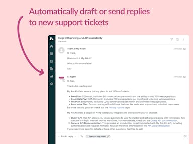
Zendesk Support Tickets
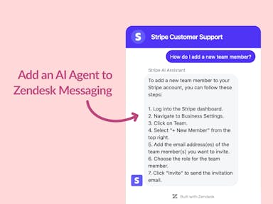
Zendesk Messaging (live chat)
Join1,000+ companies reducing their support costs and freeing up support agents for more important work
“We needed an AI agent integrated within our current tools. My AskAI was the only solution that wasn't going to disrupt our operations.”
Zeffy

“At the end of last year I was given the challenge - how can we provide the same or better service, without hiring anyone?”
Zinc
“My AskAI blew everybody else out of the water. It made the selection process very easy for us.”
Customer.io($50M+ ARR)

“It now resolves 71% of queries (over 35,000 every month), meaning more time solving complex issues and improving UX.”
Freecash

“We needed an AI agent integrated within our current tools. My AskAI was the only solution that wasn't going to disrupt our operations.”
Zeffy

“At the end of last year I was given the challenge - how can we provide the same or better service, without hiring anyone?”
Zinc

“My AskAI blew everybody else out of the water. It made the selection process very easy for us.”
Customer.io($50M+ ARR)
“It now resolves 71% of queries (over 35,000 every month), meaning more time solving complex issues and improving UX.”
Freecash


Reduce support costs.Spend more time on customer success.