Chart Types for Comparing Categories - Frequently asked questions
Frequently asked questions
What are the best chart types for comparing categories in Zendesk Explore?
Zendesk Explore offers several chart types that are ideal for comparing categories. These include bar charts, dot charts, treemaps, bubble packs, and picto charts. Each of these chart types provides a unique way to visualize data, making it easier…
How does a bar chart work in Zendesk Explore?
A bar chart in Zendesk Explore displays results from left to right, with attributes on the Y axis and metrics on the X axis. This makes it easy to compare results, especially when sorting or benchmarking. Bar charts are displayed on a grid,…
What is a dot chart and how is it used in Zendesk Explore?
A dot chart in Zendesk Explore is similar to a bar chart but uses dots to represent metric values. Attributes are displayed on the Y axis, while metrics are on the X axis, making it easy to compare results. Dot charts are useful for reports with…
How can I use a treemap in Zendesk Explore?
Treemaps in Zendesk Explore visualize hierarchical data using nested rectangles, with the size of each rectangle proportional to the attribute value. This makes it easy to compare several results at once. You can rearrange the hierarchy by…
What is a bubble pack and when should I use it in Zendesk Explore?
A bubble pack in Zendesk Explore is ideal for identifying the largest and smallest results when your attribute contains several different values. Bubbles vary in size based on the number of results a value contains. Bubble packs work best with a…
How do picto charts work in Zendesk Explore?
Picto charts in Zendesk Explore use images or symbols to visualize differences in each value, functioning best with one metric and one attribute with a small number of values. You can customize picto charts by selecting new images, adjusting icon…
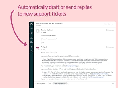
Interested indeflectingover 70% of your Zendesk support tickets?

Zendesk Support Tickets


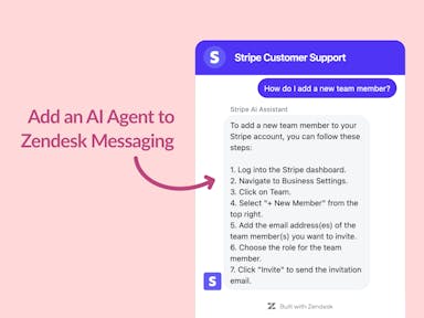
Zendesk Messaging (live chat)

Join1,000+ companies reducing their support costs and freeing up support agents for more important work
“We needed an AI agent integrated within our current tools. My AskAI was the only solution that wasn't going to disrupt our operations.”
Zeffy
“At the end of last year I was given the challenge - how can we provide the same or better service, without hiring anyone?”
Zinc
“My AskAI blew everybody else out of the water. It made the selection process very easy for us.”
Customer.io($50M+ ARR)

“It now resolves 71% of queries (over 35,000 every month), meaning more time solving complex issues and improving UX.”
Freecash

“We needed an AI agent integrated within our current tools. My AskAI was the only solution that wasn't going to disrupt our operations.”
Zeffy

“At the end of last year I was given the challenge - how can we provide the same or better service, without hiring anyone?”
Zinc

“My AskAI blew everybody else out of the water. It made the selection process very easy for us.”
Customer.io($50M+ ARR)
“It now resolves 71% of queries (over 35,000 every month), meaning more time solving complex issues and improving UX.”
Freecash


Reduce support costs.Spend more time on customer success.

