Customizing Datatips in Zendesk Explore Reports
How can I customize datatips in Zendesk Explore reports?
You can easily customize datatips in your Zendesk Explore reports to change their appearance and content. To do this, open your report and click on the chart configuration icon. From the menu, select 'Datatips' and adjust the settings as needed. You can toggle the display of datatips, choose between datatips or comparison lines, and modify the line and background colors. This allows you to tailor the datatips to better highlight your data points.
For more detailed instructions, check out the originalZendesk help article.
More related questions
How do I change the text displayed in datatips?
Changing the text in your datatips is straightforward and allows you to include specific data from your report. Open your report, click on the chart configuration icon, and select 'Datatips'. In the text box, type the desired text and use…
Can I hide datatips for null values in Zendesk Explore?
Currently, it's not possible to hide datatips for null values in Zendesk Explore. However, you can modify the text in the datatip to change how it is displayed. This can help in managing how null values are presented in your reports. For more…
How can I display both percentage and total number in datatips?
While there's no native way to display both percentage and total number in datatips, you can use a workaround. Create a duplicate of your metric and add both to your query. Set one to display as a percentage and the other as the actual value. This…
Is it possible to add an attribute to datatips not used in the report?
In Zendesk Explore, you can only add attributes to datatips that are already used in your report. If an attribute is not part of your report, it cannot be included in the datatips. This ensures that the datatips are relevant and directly related to…
How do I update datatips for combo charts in Zendesk Explore?
To update datatips for combo charts in Zendesk Explore, open your report and access the chart configuration menu. From there, select 'Datatips' and customize the settings for each data type in your combo chart. This allows you to tailor the…
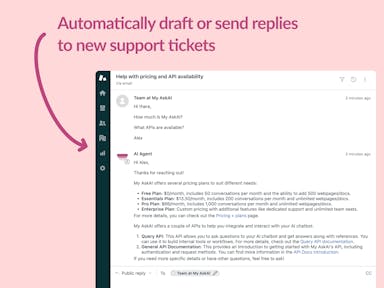
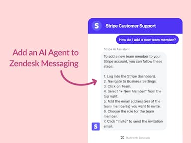
Interested indeflectingover 70% of your Zendesk support tickets?

Zendesk Support Tickets


Zendesk Messaging (live chat)

Join1,000+ companies reducing their support costs and freeing up support agents for more important work
“At the end of last year I was given the challenge - how can we provide the same or better service, without hiring anyone?”
Zinc
“We needed an AI agent integrated within our current tools. My AskAI was the only solution that wasn't going to disrupt our operations.”
Zeffy
“My AskAI blew everybody else out of the water. It made the selection process very easy for us.”
Customer.io($50M+ ARR)

“It now resolves 71% of queries (over 35,000 every month), meaning more time solving complex issues and improving UX.”
Freecash

“The difference was immediate. Customers get instant answers and our team can dedicate more time to solving complex problems"
Swytch Bike

“At the end of last year I was given the challenge - how can we provide the same or better service, without hiring anyone?”
Zinc

“We needed an AI agent integrated within our current tools. My AskAI was the only solution that wasn't going to disrupt our operations.”
Zeffy

“My AskAI blew everybody else out of the water. It made the selection process very easy for us.”
Customer.io($50M+ ARR)
“It now resolves 71% of queries (over 35,000 every month), meaning more time solving complex issues and improving UX.”
Freecash


Reduce support costs.Spend more time on customer success.

