Changing Chart Types on Zendesk Dashboards
Is it possible to change the chart type on a Zendesk dashboard?
Yes, you can change the chart type on a Zendesk dashboard if the visualization selector feature is enabled. This allows you to switch between different visualizations, such as column, line, and sparkline charts.
To change the chart type, look for the visualization selector icons in the top-left corner of the report. By clicking these icons, you can choose the chart type that best represents your data. This feature enhances the way you interpret and present your data on the dashboard.
More related questions
How can I filter data on a Zendesk dashboard?
You can filter data on a Zendesk dashboard using interactive widgets. Filters allow you to narrow down the data shown to more specific values, making it easier to focus on particular groups or channels. On prebuilt dashboards, filters are typically…
Can I change the date range on a Zendesk dashboard?
Yes, you can change the date range on a Zendesk dashboard using time interactive widgets. This feature allows you to focus on specific time periods or break down reports with a large number of results. To adjust the date range, open a dashboard…
How do I switch between different filtered versions of a Zendesk dashboard?
Switching between different filtered versions of a Zendesk dashboard is possible using the bookmark interactive widget. This feature allows you to navigate between saved filtered states of a dashboard. To switch between versions, open your…
How can I change the metrics and attributes used in a Zendesk dashboard?
To change the metrics and attributes used in a Zendesk dashboard, you need to use the change metric and change attribute interactive widgets. These widgets allow you to customize the data shown by switching the initial elements used in reports….
Interested indeflectingover 70% of your Zendesk support tickets?

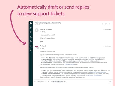
Zendesk Support Tickets
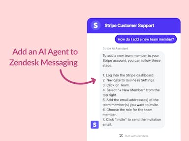
Zendesk Messaging (live chat)
Join1,000+ companies reducing their support costs and freeing up support agents for more important work
“We needed an AI agent integrated within our current tools. My AskAI was the only solution that wasn't going to disrupt our operations.”
Zeffy

“At the end of last year I was given the challenge - how can we provide the same or better service, without hiring anyone?”
Zinc
“My AskAI blew everybody else out of the water. It made the selection process very easy for us.”
Customer.io($50M+ ARR)

“It now resolves 71% of queries (over 35,000 every month), meaning more time solving complex issues and improving UX.”
Freecash

“We needed an AI agent integrated within our current tools. My AskAI was the only solution that wasn't going to disrupt our operations.”
Zeffy

“At the end of last year I was given the challenge - how can we provide the same or better service, without hiring anyone?”
Zinc

“My AskAI blew everybody else out of the water. It made the selection process very easy for us.”
Customer.io($50M+ ARR)
“It now resolves 71% of queries (over 35,000 every month), meaning more time solving complex issues and improving UX.”
Freecash


Reduce support costs.Spend more time on customer success.