Adding Attributes to Columns in Zendesk Reports
How do I add attributes to columns in Zendesk reports?
Adding attributes to columns slices your results by the attribute's values in one chart.
To add an attribute to the Columns panel, click Add and select an attribute. You can also switch attributes in the Columns and Rows panels using the pivot table feature, which saves time by automatically moving your attributes.
More related questions
What are metrics and attributes in Zendesk reports?
Metrics are quantifiable values like the number of tickets or wait times, while attributes are non-quantifiable values such as ticket IDs or assignee names. When creating a report in Zendesk, you must include at least one metric, and you can…
How can I use color and size to measure metrics in Zendesk reports?
You can use color gradients and different display sizes to measure a metric's results in Zendesk reports. To add a color or size-encoded metric, click the Color-encoding or Size-encoding icon in the Metrics panel and select your desired metric. You…
How do I add a metric as a secondary axis in Zendesk reports?
Adding a metric as a secondary axis helps compare metrics with different scales in Zendesk reports. To add a dual axis metric, click the dual axis icon in the Metrics panel and select the metric you want to use. You can edit the dual axis in the…
How can I display a metric's result as a trend line in Zendesk reports?
You can display a metric's result as a trend line to separate results in Zendesk reports. To add a metric as a trend line, click the trend line icon in the Metrics panel and select your desired metric. You can further edit trend line options, such…
How do I restrict metric results to datatips in Zendesk reports?
Restricting metric results to datatips allows users to see data without displaying it on the report. To add a metric as a datatip, click the datatips icon in the Metrics panel and select the metric you want to display. This feature is useful for…
How can I use comparison lines to highlight metric results in Zendesk reports?
Comparison lines can highlight multiple metric results for one value in Zendesk reports. To add comparison lines, go to the chart configuration menu, select Datatips, and choose Comparison line from the Mode drop-down list. This feature is…
How can I add attributes to rows in Zendesk reports?
Adding attributes to rows allows you to see individual charts for each attribute's values. To add an attribute to the Rows panel, simply select the attribute. You can view a value using the Row Selector to the left of your chart, which helps in…
What is the purpose of adding attributes to explosions in Zendesk reports?
Adding attributes to explosions breaks your report into individual charts based on the attribute's values. Unlike rows, explosions show all charts side-by-side, providing a simple way to compare results. However, if your attribute has several…
How do I use attributes as filters in Zendesk reports?
Attributes added as filters enable you to select or exclude values to include in the report results. To use attributes as filters, add them to the Filters panel. The results are filtered to the values you select, but the attribute names do not…
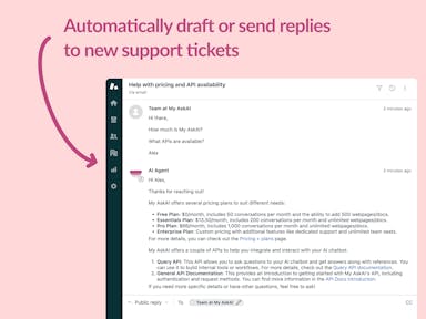
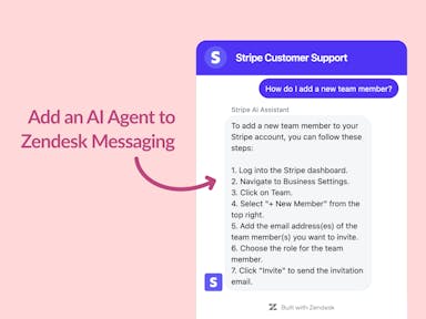
Interested indeflectingover 70% of your Zendesk support tickets?

Zendesk Support Tickets


Zendesk Messaging (live chat)

Join1,000+ companies reducing their support costs and freeing up support agents for more important work
“At the end of last year I was given the challenge - how can we provide the same or better service, without hiring anyone?”
Zinc
“We needed an AI agent integrated within our current tools. My AskAI was the only solution that wasn't going to disrupt our operations.”
Zeffy
“My AskAI blew everybody else out of the water. It made the selection process very easy for us.”
Customer.io($50M+ ARR)

“It now resolves 71% of queries (over 35,000 every month), meaning more time solving complex issues and improving UX.”
Freecash

“The difference was immediate. Customers get instant answers and our team can dedicate more time to solving complex problems"
Swytch Bike

“At the end of last year I was given the challenge - how can we provide the same or better service, without hiring anyone?”
Zinc

“We needed an AI agent integrated within our current tools. My AskAI was the only solution that wasn't going to disrupt our operations.”
Zeffy

“My AskAI blew everybody else out of the water. It made the selection process very easy for us.”
Customer.io($50M+ ARR)
“It now resolves 71% of queries (over 35,000 every month), meaning more time solving complex issues and improving UX.”
Freecash


Reduce support costs.Spend more time on customer success.

