Zendesk Workflow Chart Types Explained
What are the different chart types available for displaying workflow in Zendesk?
Zendesk offers several chart types to effectively display your organization's workflow. These include Funnel, Relational, Parallel Sets, and Word Cloud charts.
Each chart type serves a unique purpose: Funnel charts are great for organizing data based on sorting filters, Relational charts show the structure of your organization, Parallel Sets are ideal for segmenting metrics by multiple attributes, and Word Clouds visualize text results like tags or agent names. For more details, check out theoriginal Zendesk documentation.
More related questions
How do Funnel charts work in Zendesk?
Funnel charts in Zendesk help organize data based on sorting filters, similar to pie charts but with a focus on progression. You can construct a Funnel chart by breaking down a metric by categories or combining multiple metrics into a whole….
What is a Relational chart and how is it used in Zendesk?
Relational charts in Zendesk are used to display the structure of your organization, focusing on connections rather than numeric results. To create a Relational chart, add attributes to Columns and a metric as a datatip. You can customize the…
How can Parallel Set charts be utilized in Zendesk?
Parallel Set charts in Zendesk are ideal for segmenting a metric by multiple attributes to see results for every value combination. These charts show the flow of results among attributes, with dimensions and categories representing attributes and…
What is the purpose of a Word Cloud chart in Zendesk?
Word Cloud charts in Zendesk are used to visualize text results, such as tags or agent names, based on a selected attribute. The size of each word in the cloud reflects the frequency of results, with larger words indicating more occurrences. You…
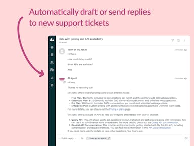
Interested indeflectingover 70% of your Zendesk support tickets?

Zendesk Support Tickets


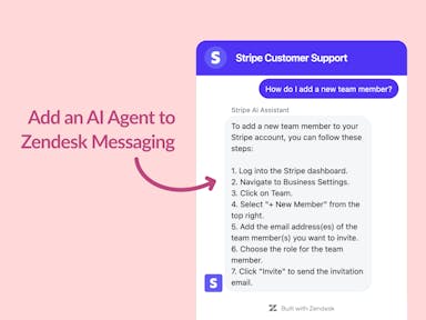
Zendesk Messaging (live chat)

Join1,000+ companies reducing their support costs and freeing up support agents for more important work
“We needed an AI agent integrated within our current tools. My AskAI was the only solution that wasn't going to disrupt our operations.”
Zeffy
“At the end of last year I was given the challenge - how can we provide the same or better service, without hiring anyone?”
Zinc
“My AskAI blew everybody else out of the water. It made the selection process very easy for us.”
Customer.io($50M+ ARR)

“It now resolves 71% of queries (over 35,000 every month), meaning more time solving complex issues and improving UX.”
Freecash

“We needed an AI agent integrated within our current tools. My AskAI was the only solution that wasn't going to disrupt our operations.”
Zeffy

“At the end of last year I was given the challenge - how can we provide the same or better service, without hiring anyone?”
Zinc

“My AskAI blew everybody else out of the water. It made the selection process very easy for us.”
Customer.io($50M+ ARR)
“It now resolves 71% of queries (over 35,000 every month), meaning more time solving complex issues and improving UX.”
Freecash


Reduce support costs.Spend more time on customer success.

