New Default Configurations for Zendesk Explore Reports
What are the new default configurations for Zendesk Explore reports?
Zendesk Explore has updated its default report configurations to enhance usability and accessibility. The changes include darker font colors for chart labels, axes, legends, and values, and transparent backgrounds for reports and chart axes. Column and bar charts are now stacked by default, with metric value labels displayed inside the columns and bars. Line charts are curved with smaller point renderers, and pie charts use all metrics to slice the chart if multiple metrics are added. KPIs show variation values by default, and area chart segments are curved and slightly transparent. Gauge and bullet visualizations use a single-color scale by default, but can be switched to a 3-color scale if needed. The row selector has all values selected, the comparison line is the default data tip style, and the Applied filters setting is not selected by default.
For more details, you can check theoriginal announcement.
More related questions
Why did Zendesk update the default configurations for Explore reports?
Zendesk updated the default configurations for Explore reports to better align with common use cases and accessibility standards. Previously, the default settings were not optimized for the most frequent reporting needs, which could lead to less…
How do the new Explore report configurations affect existing reports?
The new default configurations for Explore reports only apply to reports created after the update on November 22, 2023. Existing reports remain unchanged, so you won't see any automatic adjustments to your current data visualizations. However, you…
What are the changes to chart appearance in Zendesk Explore?
The appearance of charts in Zendesk Explore has been updated to improve clarity and accessibility. Key changes include darker font colors for chart elements, transparent backgrounds for reports and chart axes, and default stacking for column and…
Can I customize the new default configurations in Zendesk Explore?
Yes, you can still customize the new default configurations in Zendesk Explore. While the updates provide a more optimized starting point for new reports, you have the flexibility to adjust the look and feel of your reports using the Chart…
Interested indeflectingover 70% of your Zendesk support tickets?

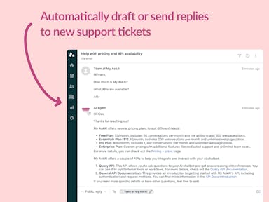
Zendesk Support Tickets


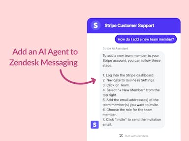
Zendesk Messaging (live chat)

Join1,000+ companies reducing their support costs and freeing up support agents for more important work
“We needed an AI agent integrated within our current tools. My AskAI was the only solution that wasn't going to disrupt our operations.”
Zeffy
“At the end of last year I was given the challenge - how can we provide the same or better service, without hiring anyone?”
Zinc
“My AskAI blew everybody else out of the water. It made the selection process very easy for us.”
Customer.io($50M+ ARR)

“It now resolves 71% of queries (over 35,000 every month), meaning more time solving complex issues and improving UX.”
Freecash

“We needed an AI agent integrated within our current tools. My AskAI was the only solution that wasn't going to disrupt our operations.”
Zeffy

“At the end of last year I was given the challenge - how can we provide the same or better service, without hiring anyone?”
Zinc

“My AskAI blew everybody else out of the water. It made the selection process very easy for us.”
Customer.io($50M+ ARR)
“It now resolves 71% of queries (over 35,000 every month), meaning more time solving complex issues and improving UX.”
Freecash


Reduce support costs.Spend more time on customer success.

