Impact of Help Center Design on User Experience
How does the design of a help center impact user experience?
The design of a help center significantly impacts user experience by ensuring ease of navigation and access to information. A well-designed help center matches the company's website look and feel, making it a seamless extension of the brand.
Prominent search bars and simple organizational structures help users find information quickly. While design evolves, the focus should always be on providing clear, accurate content. Users are more forgiving of design flaws if they can easily locate the information they need.
More related questions
How should I organize my knowledge base content in Zendesk?
Organizing your knowledge base content in Zendesk involves creating a simple structure using categories and sections. At the topmost level, you have categories, and within those, you can create sections to further organize your articles. This…
What are some examples of help center structures for different business models?
Help center structures can vary based on your business model, such as B2C, B2B, or B2E. For B2C, like online retailers, the focus is on helping customers with orders, shipping, and returns, often using a flat structure with a prominent search bar….
How can I evolve my help center's organizational structure over time?
Evolving your help center's structure involves starting simple and adapting as your knowledge base grows. Initially, you might have a few categories, but as your products and content expand, you can add more layers of organization. For instance,…
What are the best practices for writing knowledge base articles?
When writing knowledge base articles, focus on simplicity and clarity. Use concise sentences, short paragraphs, and clearly formatted step instructions. Start articles with strong action verbs like 'create', 'remove', or 'set' to guide users…
Interested indeflectingover 70% of your Zendesk support tickets?

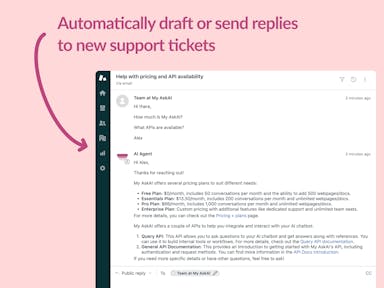
Zendesk Support Tickets


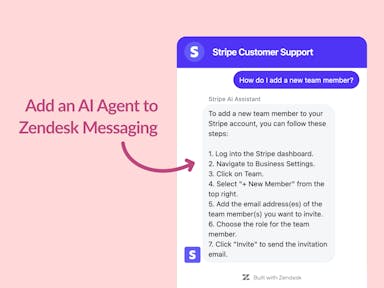
Zendesk Messaging (live chat)

Join1,000+ companies reducing their support costs and freeing up support agents for more important work
“We needed an AI agent integrated within our current tools. My AskAI was the only solution that wasn't going to disrupt our operations.”
Zeffy
“At the end of last year I was given the challenge - how can we provide the same or better service, without hiring anyone?”
Zinc
“My AskAI blew everybody else out of the water. It made the selection process very easy for us.”
Customer.io($50M+ ARR)

“It now resolves 71% of queries (over 35,000 every month), meaning more time solving complex issues and improving UX.”
Freecash

“We needed an AI agent integrated within our current tools. My AskAI was the only solution that wasn't going to disrupt our operations.”
Zeffy

“At the end of last year I was given the challenge - how can we provide the same or better service, without hiring anyone?”
Zinc

“My AskAI blew everybody else out of the water. It made the selection process very easy for us.”
Customer.io($50M+ ARR)
“It now resolves 71% of queries (over 35,000 every month), meaning more time solving complex issues and improving UX.”
Freecash


Reduce support costs.Spend more time on customer success.

