Customizing Line Charts in Zendesk Explore
How can I customize a line chart in Zendesk Explore?
Customizing a line chart in Zendesk Explore allows you to tailor it to your specific needs. You can adjust the grid, line shape, stroke width, and more.
In the chart configuration menu, you can choose to show or hide the grid, curve the lines, and change line width. You can also interpolate missing values or choose not to replace them with zero. Additionally, you can customize the colors of the grid, background, and lines, and adjust the X and Y axis styles. If using a dual axis, secondary axis settings can also be edited.
More related questions
What are the best chart types for comparing trends over time?
For comparing trends over time, charts with a left to right progression are ideal. These include line, column, area, and sparkline charts. Line charts are great for detailed time series and adding trend lines. Column charts work well for time…
What are the customization options for column charts in Zendesk Explore?
Column charts in Zendesk Explore offer several customization options to help you visualize your data effectively. You can adjust axis settings, colors, and stacking options. In the chart configuration menu, you can customize the X, Y, and secondary…
How do area charts differ from line charts in Zendesk Explore?
Area charts in Zendesk Explore are similar to line charts but with an added feature of shading the area under the line to show the weight of results. Like line charts, area charts use lines to track results over time. However, they also shade the…
What makes sparkline charts unique in Zendesk Explore?
Sparkline charts in Zendesk Explore are unique because they provide a compact view of key values and trends over time. Unlike other trend charts, sparklines highlight important values like the last, lowest, and highest values, and indicate whether…
How can I create a multiple line chart by month in Zendesk Explore?
Creating a multiple line chart by month in Zendesk Explore is possible and allows you to compare trends across different years. To achieve this, you can follow a recipe that demonstrates how to build a report with multiple lines showing monthly…
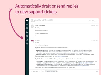
Interested indeflectingover 70% of your Zendesk support tickets?

Zendesk Support Tickets


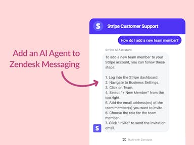
Zendesk Messaging (live chat)

Join1,000+ companies reducing their support costs and freeing up support agents for more important work
“We needed an AI agent integrated within our current tools. My AskAI was the only solution that wasn't going to disrupt our operations.”
Zeffy
“At the end of last year I was given the challenge - how can we provide the same or better service, without hiring anyone?”
Zinc
“My AskAI blew everybody else out of the water. It made the selection process very easy for us.”
Customer.io($50M+ ARR)

“It now resolves 71% of queries (over 35,000 every month), meaning more time solving complex issues and improving UX.”
Freecash

“We needed an AI agent integrated within our current tools. My AskAI was the only solution that wasn't going to disrupt our operations.”
Zeffy

“At the end of last year I was given the challenge - how can we provide the same or better service, without hiring anyone?”
Zinc

“My AskAI blew everybody else out of the water. It made the selection process very easy for us.”
Customer.io($50M+ ARR)
“It now resolves 71% of queries (over 35,000 every month), meaning more time solving complex issues and improving UX.”
Freecash


Reduce support costs.Spend more time on customer success.

