Create Line Chart for Solved Tickets in Zendesk Explore
How can I create a line chart to compare solved tickets this year to last year in Zendesk Explore?
Creating a line chart to compare solved tickets by year in Zendesk Explore is straightforward. First, ensure you have Zendesk Explore Professional or Enterprise and the necessary permissions. Then, in Explore, click the reports icon and select 'New report'. Choose the 'Support - Tickets' dataset and start your report. Add 'Tickets' as a metric, and 'Ticket Solved - Month' and 'Ticket Solved - Year' as attributes. Set the date range from one year in the past to today, and select the line visualization type. This setup will allow you to visualize and compare the number of tickets solved each month for the current and previous year.
More related questions
What permissions are needed to create reports in Zendesk Explore?
To create reports in Zendesk Explore, you need to have Editor or Admin permissions. These permissions allow you to access the necessary datasets and tools within Explore to build and customize reports. If you're unsure about your permissions, you…
Why might the current year not appear in my Zendesk Explore report?
If the current year isn't appearing in your Zendesk Explore report, it could be due to filters or custom fields affecting the data display. Check if any custom fields are in use as filters, as they might limit the time periods shown. Additionally,…
How can I ensure all years are displayed in my Zendesk Explore chart?
To ensure all years are displayed in your Zendesk Explore chart, use the 'Row Selector' feature. Set the 'Selected values' to 'Select all' to include every year in your dataset. This adjustment helps prevent any years from being inadvertently…
What should I do if my Zendesk Explore dashboard values seem incorrect?
If your Zendesk Explore dashboard values appear incorrect, check the filters applied to your dashboard and reports. Ensure they are linked to the correct dataset and not interfering with your data. If the issue persists, consider opening a support…
Interested indeflectingover 70% of your Zendesk support tickets?

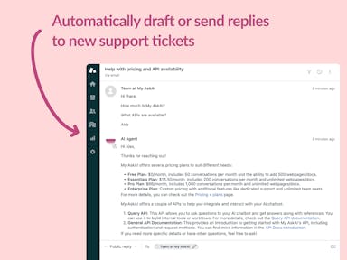
Zendesk Support Tickets
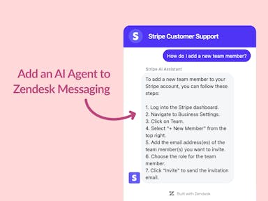
Zendesk Messaging (live chat)
Join1,000+ companies reducing their support costs and freeing up support agents for more important work
“We needed an AI agent integrated within our current tools. My AskAI was the only solution that wasn't going to disrupt our operations.”
Zeffy

“At the end of last year I was given the challenge - how can we provide the same or better service, without hiring anyone?”
Zinc
“My AskAI blew everybody else out of the water. It made the selection process very easy for us.”
Customer.io($50M+ ARR)

“It now resolves 71% of queries (over 35,000 every month), meaning more time solving complex issues and improving UX.”
Freecash

“We needed an AI agent integrated within our current tools. My AskAI was the only solution that wasn't going to disrupt our operations.”
Zeffy

“At the end of last year I was given the challenge - how can we provide the same or better service, without hiring anyone?”
Zinc

“My AskAI blew everybody else out of the water. It made the selection process very easy for us.”
Customer.io($50M+ ARR)
“It now resolves 71% of queries (over 35,000 every month), meaning more time solving complex issues and improving UX.”
Freecash


Reduce support costs.Spend more time on customer success.