Choosing the Right Chart Type in Zendesk Explore
How do I choose the right chart type for my data in Zendesk Explore?
Choosing the right chart type in Zendesk Explore depends on the data you want to present. For trends over time, consider line or column charts. To display workflows, funnel or relational charts are ideal. For comparing categories, bar or dot charts work well. Each chart type serves a specific purpose, so it's important to match your data with the appropriate visualization. For more guidance, refer to the originalZendesk help article.
More related questions
How can I change the chart type in Zendesk Explore?
To change the chart type in Zendesk Explore, you can use the Visualization type menu. In the report builder, simply click the Visualization type menu located in the right sidebar and select a new chart type. Once you've made your selection, click…
What customization options are available for charts in Zendesk Explore?
Zendesk Explore offers a variety of customization options for charts, allowing you to tailor the appearance and functionality to your needs. You can edit colors, text, and interactions from the Chart configuration menu. Options include changing…
Can I edit the colors of my chart in Zendesk Explore?
Yes, you can edit the colors of your chart in Zendesk Explore. This includes changing the text and result colors. If you are the account owner, you can also set the default color in the Admin menu. Customizing colors can help make your data more…
What are the specific chart types for comparing trends over time in Zendesk Explore?
In Zendesk Explore, when you want to compare trends over time, you can use chart types like Line, Column, Area, and Sparkline. These charts are designed to show a left-to-right progression, providing a clear sense of flow and change over time….
How can I customize the axes in my chart in Zendesk Explore?
In Zendesk Explore, you can customize the X, Y, and secondary axes of your chart. This includes editing settings such as color, visibility, and label size. If you have a dual axis chart, you can also edit the secondary axes. To change the name of…
What are the options for displaying workflow in Zendesk Explore?
To display workflow in Zendesk Explore, you can use chart types like Funnel, Relational, Parallel set, and Word cloud. These charts focus on demonstrating how results progress rather than comparing them, making them ideal for visualizing workflows….
How do I add a trend line to my chart in Zendesk Explore?
Adding a trend line to your chart in Zendesk Explore is a great way to highlight trends in your data. You can add and format a trend line through the Chart configuration menu. This feature allows you to visually represent the direction and pattern…
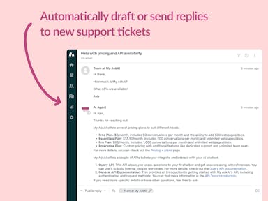
Interested indeflectingover 70% of your Zendesk support tickets?

Zendesk Support Tickets


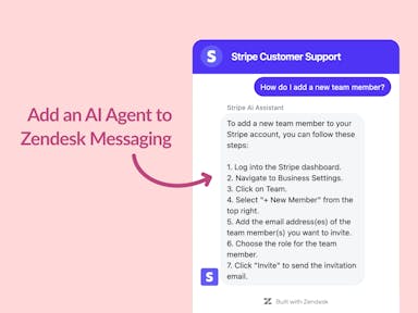
Zendesk Messaging (live chat)

Join1,000+ companies reducing their support costs and freeing up support agents for more important work
“At the end of last year I was given the challenge - how can we provide the same or better service, without hiring anyone?”
Zinc
“We needed an AI agent integrated within our current tools. My AskAI was the only solution that wasn't going to disrupt our operations.”
Zeffy
“My AskAI blew everybody else out of the water. It made the selection process very easy for us.”
Customer.io($50M+ ARR)

“It now resolves 71% of queries (over 35,000 every month), meaning more time solving complex issues and improving UX.”
Freecash

“The difference was immediate. Customers get instant answers and our team can dedicate more time to solving complex problems"
Swytch Bike

“At the end of last year I was given the challenge - how can we provide the same or better service, without hiring anyone?”
Zinc

“We needed an AI agent integrated within our current tools. My AskAI was the only solution that wasn't going to disrupt our operations.”
Zeffy

“My AskAI blew everybody else out of the water. It made the selection process very easy for us.”
Customer.io($50M+ ARR)
“It now resolves 71% of queries (over 35,000 every month), meaning more time solving complex issues and improving UX.”
Freecash


Reduce support costs.Spend more time on customer success.

