Zendesk Message Grouping Updates
How has message grouping changed in Zendesk's ticket interface?
In the updated Zendesk ticket interface, message grouping has been improved by not repeating the header for messages from the same customer within a one-minute interval. This change reduces clutter and makes it easier for agents to follow the conversation flow. You can still hover over a message to see the exact time it was sent, ensuring that no important details are missed.
More related questions
What are the new visual changes in Zendesk's ticket conversation interface?
Zendesk has introduced a new look and feel for the ticket conversation interface to help agents quickly absorb and parse information. These changes are purely visual and do not affect how tickets function. Key updates include redesigned agent…
How do the new agent badges in Zendesk's interface help?
The new agent badges in Zendesk's interface make it easier to distinguish between agent and customer comments. By hovering over the badge, you can see an Agent tooltip, which provides additional context. This change is part of a broader effort to…
What improvements have been made to message bubbles in Zendesk?
Zendesk has updated message bubbles to help distinguish between different types of messages. Agent messages now have a different shading compared to customer messages, while internal notes retain their original shading. This visual distinction…
Why is Zendesk updating the ticket conversation interface?
Zendesk is updating the ticket conversation interface to provide a more modern and intuitive experience for agents. The changes are designed to make tickets easier to scan and navigate, allowing agents to quickly access the information they need….
Do I need to take any action for the new Zendesk interface changes?
No action is required on your part for the new Zendesk interface changes. These updates will roll out automatically to all accounts with the Agent Workspace. However, you can participate in the beta release to familiarize yourself with the changes…
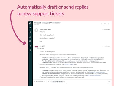
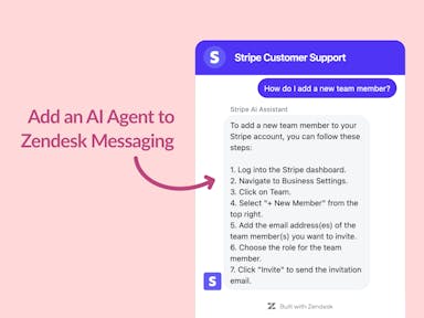
Interested indeflectingover 70% of your Zendesk support tickets?

Zendesk Support Tickets


Zendesk Messaging (live chat)

Join1,000+ companies reducing their support costs and freeing up support agents for more important work
“We needed an AI agent integrated within our current tools. My AskAI was the only solution that wasn't going to disrupt our operations.”
Zeffy
“At the end of last year I was given the challenge - how can we provide the same or better service, without hiring anyone?”
Zinc
“My AskAI blew everybody else out of the water. It made the selection process very easy for us.”
Customer.io($50M+ ARR)

“It now resolves 71% of queries (over 35,000 every month), meaning more time solving complex issues and improving UX.”
Freecash

“We needed an AI agent integrated within our current tools. My AskAI was the only solution that wasn't going to disrupt our operations.”
Zeffy

“At the end of last year I was given the challenge - how can we provide the same or better service, without hiring anyone?”
Zinc

“My AskAI blew everybody else out of the water. It made the selection process very easy for us.”
Customer.io($50M+ ARR)
“It now resolves 71% of queries (over 35,000 every month), meaning more time solving complex issues and improving UX.”
Freecash


Reduce support costs.Spend more time on customer success.

