Understanding Sunburst Charts in Zendesk Explore
What is a sunburst chart and how can I use it in Zendesk Explore?
A sunburst chart in Zendesk Explore is a hybrid of a pie chart and a treemap, ideal for displaying hierarchical data. It segments results by category, showing them in a layered, circular format. This chart type is useful when you have multiple results, as it can aggregate smaller values using a top/bottom filter.
You can customize your sunburst chart by selecting a color palette for categories and subcategories, and by choosing whether to display metric aggregators in datatips. This makes it a versatile option for visualizing complex data structures.
More related questions
How can I use pie charts to compare values to total results in Zendesk Explore?
Pie charts in Zendesk Explore are great for visualizing how individual values contribute to a total result. You can construct them by breaking down a metric by category results or by combining multiple metrics into a natural whole. They work best…
How can I customize the colors in my Zendesk Explore pie chart?
Customizing colors in your Zendesk Explore pie chart is straightforward. You can change both the background and chart colors through the Colors section in the chart configuration menu. This allows you to tailor the visual appearance of your chart…
Can I display data labels permanently on a pie chart in Zendesk Explore?
While Zendesk Explore allows you to view data labels by hovering over segments, displaying them permanently requires a workaround. You can remove the color legend to make the chart less cluttered, but currently, there's no direct feature to…
How do I change attribute labels in a pie chart in Zendesk Explore?
To change attribute labels in a pie chart within Zendesk Explore, you can create a renamed set. This involves going to Calculations > Renamed Set, selecting your attribute, and entering new names for each value. Replace the existing attribute with…
Interested indeflectingover 70% of your Zendesk support tickets?

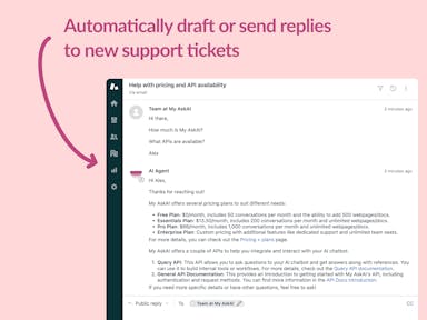
Zendesk Support Tickets
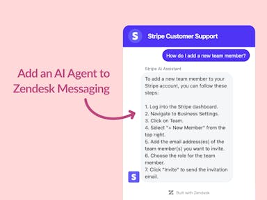
Zendesk Messaging (live chat)
Join1,000+ companies reducing their support costs and freeing up support agents for more important work
“We needed an AI agent integrated within our current tools. My AskAI was the only solution that wasn't going to disrupt our operations.”
Zeffy

“At the end of last year I was given the challenge - how can we provide the same or better service, without hiring anyone?”
Zinc
“My AskAI blew everybody else out of the water. It made the selection process very easy for us.”
Customer.io($50M+ ARR)

“It now resolves 71% of queries (over 35,000 every month), meaning more time solving complex issues and improving UX.”
Freecash

“We needed an AI agent integrated within our current tools. My AskAI was the only solution that wasn't going to disrupt our operations.”
Zeffy

“At the end of last year I was given the challenge - how can we provide the same or better service, without hiring anyone?”
Zinc

“My AskAI blew everybody else out of the water. It made the selection process very easy for us.”
Customer.io($50M+ ARR)
“It now resolves 71% of queries (over 35,000 every month), meaning more time solving complex issues and improving UX.”
Freecash


Reduce support costs.Spend more time on customer success.