Customizing Bubble Charts in Zendesk Explore
What are bubble charts and how can I customize them in Zendesk Explore?
Bubble charts in Zendesk Explore are similar to scatter plots and use two metrics for the X and Y axes. They are ideal for representing two metrics, with multiple attributes placed on columns to form the points on the chart. When you hover over a point, you can see the value's results.
To customize a bubble chart, you can adjust the size, opacity, and shape of the circles, choosing from options like empty circle, diamond, triangle, or cross. Additionally, you can modify trend lines, axes, and legend options, with legends appearing only if necessary. The grid and row colors can also be edited for better visual distinction. For more details, check out theoriginal link.
More related questions
How do radar charts work in Zendesk Explore and what customization options are available?
Radar charts in Zendesk Explore allow you to compare at least three metrics, each with its own scale, represented as colored lines. The attribute's values are shown as lines, and you can rearrange the axes by reordering the metrics. Customization…
What is the difference between bubble and radar charts in Zendesk Explore?
The main difference between bubble and radar charts in Zendesk Explore lies in the number of metrics they can represent and their visual structure. Bubble charts use two metrics for the X and Y axes, making them suitable for comparing two metrics…
Can I add attributes to rows in radar charts in Zendesk Explore?
Yes, you can add attributes to rows in radar charts within Zendesk Explore. This feature enables viewers to click through a series of results using the row selector. However, it's important to note that radar charts do not support multi-selection…
What customization options are available for axes and legends in Zendesk Explore charts?
In Zendesk Explore, both bubble and radar charts offer customization options for axes and legends. You can modify the appearance of trend lines, axes, and legends to better suit your data presentation needs. For bubble charts, legends appear only…
Interested indeflectingover 70% of your Zendesk support tickets?

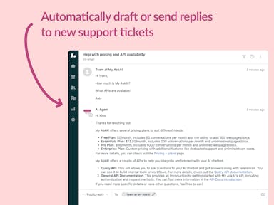
Zendesk Support Tickets


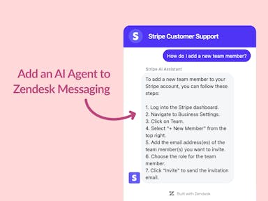
Zendesk Messaging (live chat)

Join1,000+ companies reducing their support costs and freeing up support agents for more important work
“We needed an AI agent integrated within our current tools. My AskAI was the only solution that wasn't going to disrupt our operations.”
Zeffy
“At the end of last year I was given the challenge - how can we provide the same or better service, without hiring anyone?”
Zinc
“My AskAI blew everybody else out of the water. It made the selection process very easy for us.”
Customer.io($50M+ ARR)

“It now resolves 71% of queries (over 35,000 every month), meaning more time solving complex issues and improving UX.”
Freecash

“We needed an AI agent integrated within our current tools. My AskAI was the only solution that wasn't going to disrupt our operations.”
Zeffy

“At the end of last year I was given the challenge - how can we provide the same or better service, without hiring anyone?”
Zinc

“My AskAI blew everybody else out of the water. It made the selection process very easy for us.”
Customer.io($50M+ ARR)
“It now resolves 71% of queries (over 35,000 every month), meaning more time solving complex issues and improving UX.”
Freecash


Reduce support costs.Spend more time on customer success.

